Why design a shadcn/ui Figma library?
In our previous blog post we talked about what shadcn is.
Today I would like to talk about why we're creating an open source and free shadcn/ui library for Figma.
As a design team, we've worked on hundreds of design projects. Since quite some time, design has become heavily componentized.
When you build out an interface in Figma, you are not likely to be drawing everything manually, rather using a system that aligns with a development environment. A lot of people are quick to call this “design systems” but I rather like when we are solely talking about the components to call them component libraries.
There are different ways to go about designing a user interface: you could design exactly to your taste and then leave the developer with the problem of figuring out the implementation.
But what you could also do, is to start your user interface design from the logic of an existing system.
If what you draw as a designer uses the same logic as what a developer will use, you can find a lot of efficiencies.
Lately I've been saying that shadcn/ui is the new Bootstrap. In 2014, Bootstrap, a framework made by Twitter, was the starting point for many designers and developers to craft app-like interfaces.
It came with a bunch of pre-built HTML/CSS components, a way to customize it, and also some Javascript logic around interactive components such as tooltips and popovers.

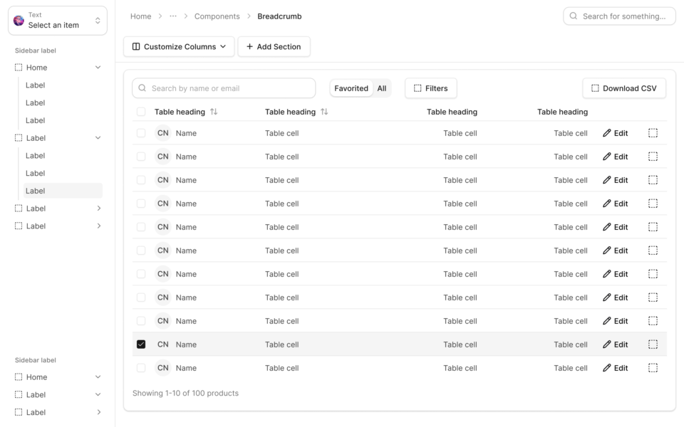
A web app example screen created with our upcoming shadcn/ui kit.
With my previous design company Mono we worked with Bootstrap a lot, finding great success in using it as a base for design and development. In design, we would be wary of the defaults of Bootstrap and if there was no particular reason to change them (e.g. an internal, unbranded app) we would stay with the defaults to make development easier.
After working with Bootstrap for a while, we found the problems within Bootstrap and started extending Bootstrap to our liking. I remember writing code to have a better way to position controls in dialogs and toolbars as one of our major extensions.
The same pattern occured with Material Design. It's important as a UI designer to first understand the design work that went into the framework, and when you truly understand it, customize it where it makes sense.
The frameworks that rise to the surface are often made by the brightest minds and best thinkers in design and front-end. It's worthwhile to understand why things are the way they are.
A cursory look at shacdn/ui might leave you with a lot of questions. Why is there no “alert success” variant for Alert? Why is the primary button not blue? The first line in the intro in the docs bears repeating: This is not a component library. It is how you build your component library.
It's really important to understand that shacdn/ui is the base for the rest of your design choices. It's not the final design - it's a starting point. You are supposed to customize it from that point.
So why design a shadcn/ui library?
We determined that the existing component libraries on Figma community do not meet our quality standards or have other types of problems like licensing problems.
We think we can do better, and we think a public kit fits together with shadcn/ui being a free and open source project.
We're looking forward to showing our work to the world. In the meantime, if you'd like early access or are particularly interested, head over to the Github repo.

As the founder of Obra Studio, Johan's mission is to help software companies get to the next design level. He’s forever looking for the perfect balance between aesthetics and usability.